Each day, you take around 10,000 decisions.
Don’t worry, most of them are intuitive but there are still 10 to 20 more complicated choices and probably less than 5 decisions needing your full attention.
Those 5 decisions required often a tight timeframe while stress and bias can blur your mind :
You need to understand quickly and make the right choice.
You certainly have tons of data available and several dashboards to support you.
Most of them cannot probably support you enough (Gartner said that 70% in average don’t) : you ask your best analysts to crunch the data asap. They are great to deep dive into your data lake but on a short timeline, they won’t probably succeed in finding the right KPI you could use to make a 100% straight decision.
What is data design ?
Based on UX design principles data design makes your data speak by talking to the users’ eyes – 50% of the human brain is dedicated to it. In other words, data design increase datavisualization efficiency.
While a standard datavisualization will go straight to the graph or dashboard building, data design is going deeper in the preparation phase :
Data design focus first on what you’re looking for. The decision you need to take, the question you need to answer or the idea you have to « sell » to your organization to federate people.
Audience definition
Your visualization will be totally different if you talk to corporate or public. And even in the corporate world, the dashboard or the graph used to take a decision or to solve an issue is different if the audience is C-level, manager or analyst. Taking their expertise level is fundamental. I ask myself a simple question : How much time do they have to understand the visualization ? Public target will have time to read it while a C-level member won’t have more than few seconds.
Prepare the data
The biggest part which represent around 80% of the job.
Define and select the data you need is fundamental. But you must to challenge the data quality. If the quality is bad or if the data is not complete, you might create bias and, in the end, a bad decision. Then, we have to rank and organize those data before analyzing it.
I usually take a funnel approach : macro trend and then, deep dive to extract the insight.
A short parenthesis if you are a data expert – manager or individual contributor – it might very useful to integrate a data designer in the data modelization process or even in the data gouvernance process building. As she or he works with the business team, it will be an asset to explain the KPI definition and a good way to challenge your data model and make it more efficient. It will notably, increase analysis or dashboard execution performances.
Create the right visualization
Then comes the heart of the data design process : create the right visualization to answer the purpose, speak to the audience and illuminate the data : right chart, right (and accessible) colours, right highlight, balanced quantity of information. Sometimes it could be a simple graph summing up the situation, a diagram, an Infographic or dashboard if interaction is required. But animation is possible if it’s interesting to display the evolution of a phenomenon over the time for example.
Last part of the data design approach is the storytelling to explain numbers and graphs : giving some context, explaining how to read the information, bringing some benchmark. Narrative is key in data design. All the points above could be checked, if this step is missing, mission is uncomplete.
Data design and data art
Both use data as raw material to create stunning visualizations.
But data design is rational while data art is emotional :
Data design facilitates your understanding of a situation thanks to your data. Decide, solve and increase engagement is the goal.
Data art could be more abstract and aestheticised : an optimized time for reading and understanding is not the purpose.
A data designer is a data artist but the other way, not necessarily.
Data design benefit
If a graph or a dashboard is easier to understand, you will find a solution or make a decision quicker.
A quicker solution or decision is an advantage on your competitors.
You win.
It’s not only about decision making.
Choosing a data design approach by getting the right design for your data will :
Create a more efficient communication that increase support from your team, your company, your customers, your audience.
Save time and money and reduce the stress linked to multiple and unuseful dashboards : it takes time (so money) to create multiple dashboards, adding layers over the time but even more time and money to maintain them. Keep things simple as much as possible.
Without data design, a data visualization may lack visibility, exude amateurism or embarrassing if you’re sharing it with a demanding audience.
Data design success story
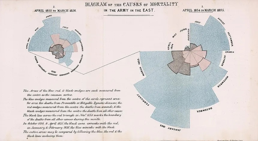
I’d like to share with you a data design that inspire me and keep me on track when I doubt about making a design : Florence Nightingale’s coxcomb chart.
It’s the perfect illustration of the data design essence : it provides information in aesthetic and accurate way about a crucial issue and serves 2 purpose : alerting about the issue and tracking its resolution.
Florence Nightingale was a British nurse who served during the Crimea war between 1853 and 1856. She noticed dramatic sanitary conditions in hospitals that increased death rate while she spent a lot of time with the wounded soldiers, working sometimes 20 hours a day.
Florence was also a statistician. She tracked the death rate in a notebook and decided to alert her hierarchy (and even the Royal Family !) about the situation and the necessity to improve hygienic conditions.
She used those data to design what she called a « coxcomb » chart, illustrating the soldiers mortality between 1854 and 1856 during the Crimea war.
How to read this polar area diagram ? 3 colours represent the death cause and the size of the area (warning : it starts from the center) shows the volume of deaths.
- Blue : deaths caused by diseases
- Red : deaths from wounds
- Black : deaths from other causes
Florence Nightingale is a real hero : she contributed to make health care evolve.
That’s my personal and probably subjective feeling but her designed diagram facilitated the phenomenon comprehension by her hierarchy and the emergency to improve sanitary methods.
That’s why data design is so important.
Is data design still a buzz word ?
There are more and more data. Everywhere. In all aspect of our life. Technology to store it and talented people to process it are easily available. But if you don’t exploit it, if you don’t know how to make your data speak, it’s like letting your money sleeps in your checking account at the bank : generating no interest, no leverage to create more value. Thanks to data design, you are able to value your data as a real asset for your company performance and success.
5 points to take away :
- Data design consists in spending time to create the datavizualisation final product to reduce as much as possible the time spent by the user to process it.
- Data design is a global process which take into account the issue, the audience, the data and the storytelling
- Data design facilitates a decision to make while data art creates emotion
- Florence Nightingales shows the power of data design that helps to alert and solve a concrete issue
- Data design transforms your data into an asset to serve your company performance and success
Do you want to revive your data ? Send me a message let’s talk about it !
Ping : Data design to decide